News reading apps are the quiet ninjas of the mobile world. On the face of it, they perform a simple, repetitive task: displaying the daily news. Whether it's the Huffington Post, the BBC, The Guardian or the Mail Online, they all go about this task in very similar ways.
Behind the scenes, however, the popularity of the leading news outlets is so great, and there’s so much pressure to engage and retain habitual readers (who are fussy and spoilt for choice), that news reading apps have become the focus of huge amounts of technical skill and resources, both in terms of software development and QA. The apps may be simple, but perfecting them isn’t.
In this case study, we'll use GameBench to peer behind the curtain and try to understand the key areas of optimisation within a sample of newsreading apps -- all of which are already pretty highly optimised, but none of which are totally perfect. As usual, we're not so much interested in functional testing (i.e., basic stuff like whether the apps crash or not). Instead, we're looking at the responsiveness of what the end user sees and touches on their mobile display, firstly in terms of wait times and secondly with respect to smooth scrolling.
We'll measure these two aspects of UX by running GameBench in the background while manually stress-testing each news app, simulating a morning commuter who has ingested too much caffeine and is trying to load up and skim read as many stories as possible within a three-minute session.
1. Wait times
When a user taps an interesting headline on an index page, how long do they have to wait for their chosen article to be displayed? This wait time may depend partly on the speed of their internet connection, but -- as we’ll see -- it’s also very dependent on app optimisation.
The following frame rate chart, recorded with the Huffington Post (UK Edition) running on a relatively old and cheap HTC Desire 816 Android phone, shows a typical news reader app pattern. The frame rate is mostly high while the user scrolls through an index, then it drops close to zero when they stop scrolling and tap on a story, and then it shoots back up again when the new story loads and they start scrolling again. The pattern isn't always perfect and may be hard to spot at first (partly because we're looking at very frenetic test sessions), but on the whole it creates a series of "hills" in the frame rate chart, representing the index-article-index-article sequence. The arrows in the chart below indicate some moments of transition between index and article:
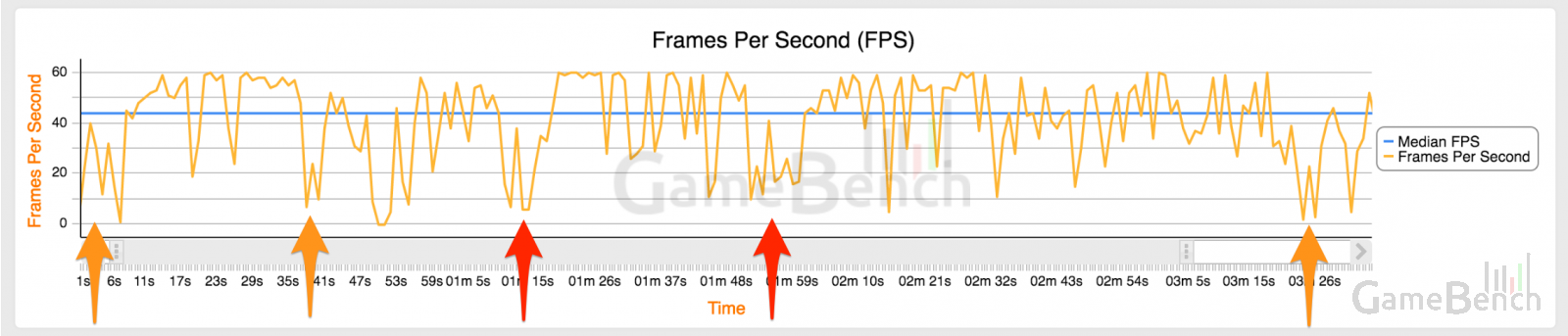
Nearly all of the frame rate drops in this session were momentary, quickly rebounding below 10fps to above 45fps, indicating that the user moved from index to article without delay. However, there were exceptions at 1:14 and 1:55 (both shown with red arrows), where the frame rate rebound was less immediate and the gap between the two neighbouring "hills" in the chart was slightly wider -- potentially indicating a UX problem.
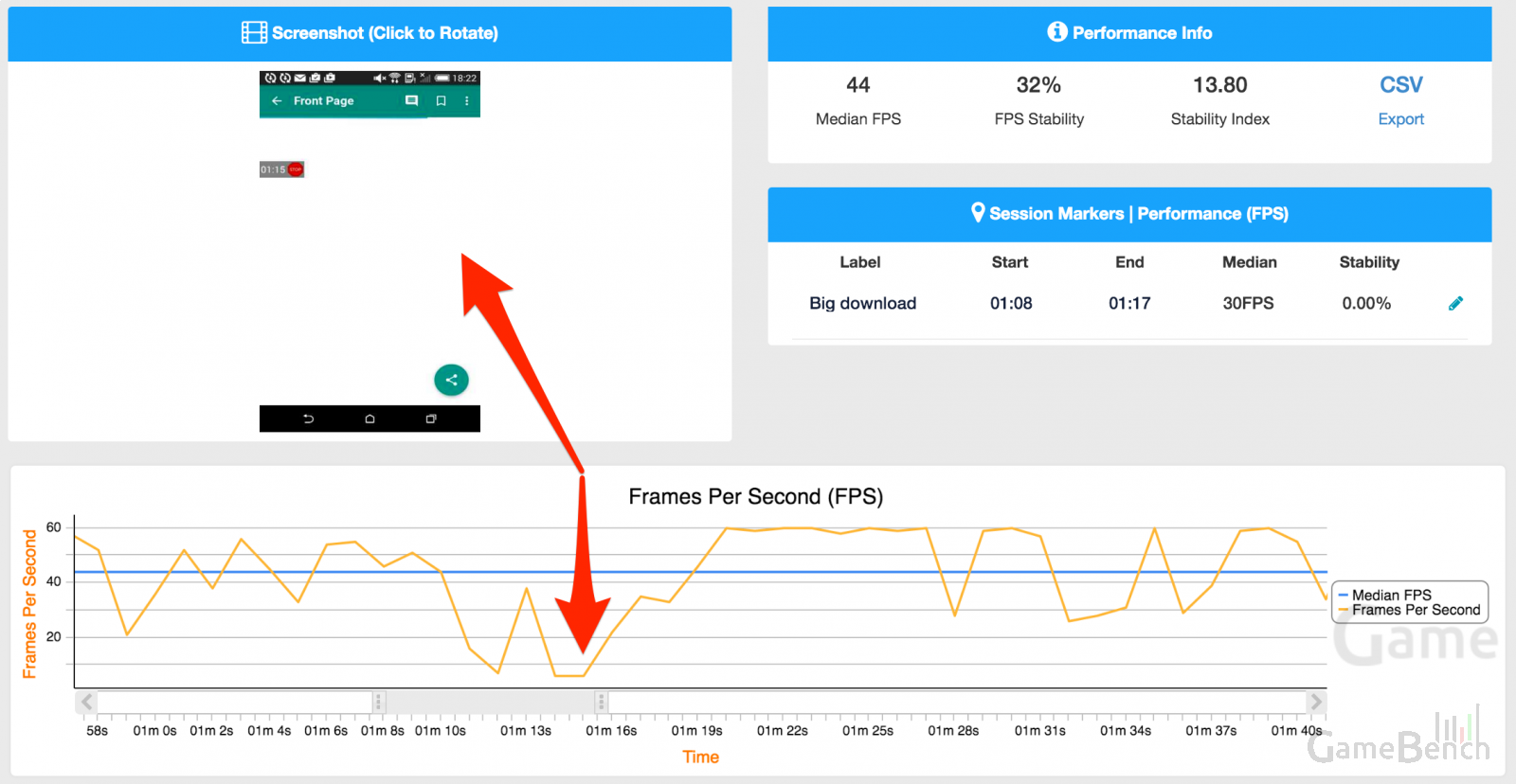
Zooming in on the frame rate dip at 1:14 and correlating with screenshots tells us that the user tapped a story at 1:14 but was shown dead screens between 1:15 and 1:17 until their story finally showed up at 1:18. This means they experienced a wait time of around three seconds, which may or may not be considered good enough by the developer or QA team:
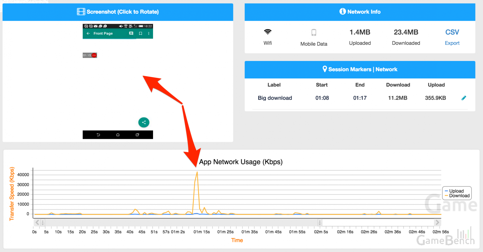
What caused this wait time? Looking at the Network chart suggests one likely cause: a big 12MB download which lasted from 1:08 to 1:17 and which might have prioritised other data (e.g. other articles or ads that were being cached or "pre-downloaded" in order to speed them up later) rather than the data needed to display this one specific article. (There was also a smaller burst of network activity at 1:55, matching the time code of the second static screen episode and suggesting that this was due to a story which had not been cached and needed an extra second or so to download.):
An occasional delay of a few seconds probably isn't a huge disaster for UX, but we actually noticed some longer delays in other news apps running on the same HTC device in the same connectivity environment, and these were also correlated with network activity. This included one BBC News story which took a full seven seconds to appear because the necessary packet of traffic was only received after six seconds. There was also a Guardian story that took four seconds to appear and which actually showed the lead image before the article text -- in other words, big and less urgent data was wrongly prioritised over small and more urgent data. By contrast, the Mail Online app had very short wait times, with none lasting more than a second, and this was apparently due to more effective caching (something we'll come back to in a bit).
2. Smooth scrolling
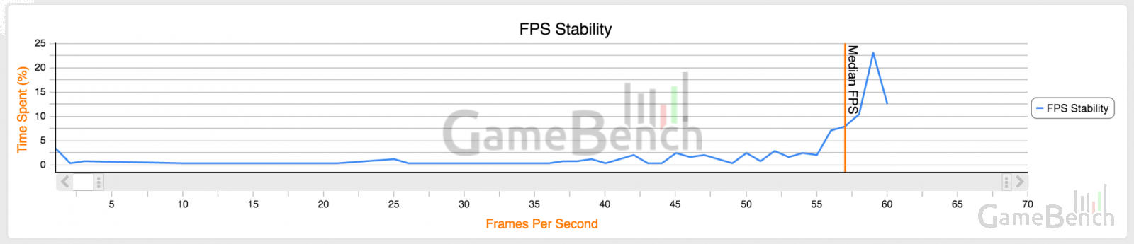
The main interfaces of both iOS and Android are animated at a steady, consistent 60 frames per second. In order to feel native to the device, it’s important that apps animate with the same degree of smoothness. On a frame rate stability chart, this should look like a single tall, sharp peak at 60fps. With The Guardian app running on a top-end iPhone 6S, this is exactly the shape we see, showing that a very high proportion of the session time took place at this smooth level of animation -- in this case resulting in a median of 57fps:
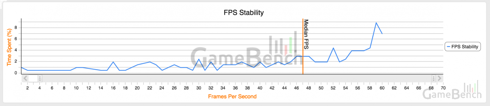
However, with all the news apps we tested, we saw that this 60fps peak was somewhat less apparent when we tested them on older devices, and also on Android devices. We don’t want to single out The Guardian here, as it was far from the only culprit, but it provides a useful illustration when comparing across the iPhone 6S and the older iPhone 5 (median = 47fps) :
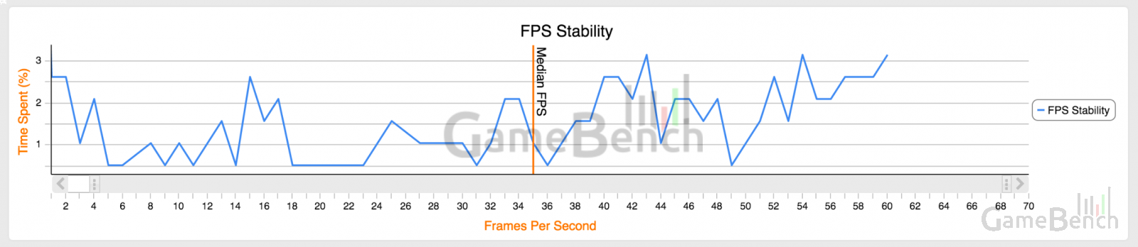
We can also compare the same app running on the HTC Desire 816 (median = 35fps):
Ultimately, if only a small proportion of a test session is experienced at 60fps, then this is another red flag indicating a possible UX problem. It's up to individual app creators to determine where the boundaries should be drawn for their particular product, because each type of app is different -- an e-book reader would have much less time at 60fps time than a news reader, for example. Even within a specific genre of app, each type of user may also be different -- for example, a user who reads slowly may naturally experience less time at 60fps. Nevertheless, its worth testers and developers setting out the FPS proportions that they consider to be normal and healthy, based on real-world testing.
Wrap-up and possible solutions
The purpose of this article has not been to criticise any apps or expose their weaknesses. On the contrary, we think that the apps we looked at are all relatively good compared to a few other products we've briefly examined in this genre.
Our real purpose in highlighting imperfections is to show where optimisation matters most to the user experience and start to a discussion that could ultimately lead to some general solutions or ideas about best practice. To get that discussion going, here’s a few suggestions:
Firstly, with regard to the problem of unwanted static screens during waiting times, a simple solution is to ensure that a loading animation is consistently displayed. Most news apps do have such an animation in order to reassure users that their article is on its way, but not all the apps played this animation consistently.
Secondly, one of the real areas of skill within news apps concerns the way data is downloaded and cached. Here, the Mail Online looks to be especially well optimised, since it downloads data in a way which causes minimal additional waiting time. A large amount of text-based content seems to be downloaded early on in a session, whereas pictures are considered to be secondary based on available bandwidth. It’s also interesting to note that the Mail Online app gives users a choice about how they want to cache or “pre-download” article images.
Finally, the hardest problem of all concerns Android optimisation -- an area where most of the apps we looked at struggled to some degree. We can’t suggest any quick fix here, beyond stating something which is probably quite obvious: Android apps perform best when they’re built purely for Android, rather than being ported or re-versioned from a pre-existing iOS app. News reading should be a doddle for any relatively modern Android phone, even it has a low-end processor, but ground-up development and testing is key.
In the short-term, anyone who commissions the creation of a cross-platform app, whether from an internal or outsourced development team, could start by refusing to accept delivery of anything that doesn’t have broadly equivalent performance on both iOS and Android -- and the techniques illustrated in this article could be used to test that very quickly.
DIY
If you'd like to use GameBench to test your app, you can do so for free by registering and then downloading one of our performance metric collection tools. The simplest tool to start with is the GameBench desktop app for Windows, Mac or Linux, which lets you test any iOS or Android app simply tethering your test device to your PC, hitting "Record" and then using the app for a few minutes. You then use the "Sync" button to upload your data to the cloud, where it can be visualised using the GameBench web dashboard. This is how the sessions described above were gathered and visualised.